The blog of dlaa.me

Posts tagged "Silverlight Toolkit"

"If I have seen further, it is by standing on the shoulders of giants" [An alternate implementation of HTTP gzip decompression for Windows Phone]

The HTTP protocol supports data compression of network traffic via the Content-Encoding header. Compressing network traffic is beneficial because it reduces the amount of data that needs to be transmitted over the network - and sending fewer bytes obviously takes less time! The tradeoff is that it takes a bit of extra work to decompress the data, but because the bottleneck is nearly always network, HTTP compression should be a win pretty much every time. And when you're dealing with comparatively slow, unreliable networks like the ones used by cell phones, the advantages of compression are even more significant.

Aside: Because most networks are lossy and transfer data in packets, sending just one fewer byte can be meaningful if it reduces the number of packets.


You might reasonably expect that enabling compression for Windows Phone web requests is as simple as setting the HttpWebRequest.AutomaticDecompression property available since .NET 2.0. Unfortunately, this property is not supported by current versions of the Windows Phone platform, so it's up to application developers to add HTTP compression support themselves. Consequently, a number of home-grown solutions have cropped up.

One popular example is Morten Nielsen's GZipWebClient. Naturally, Morten didn't want to implement his own compression library, so he's using SharpZipLib to do the heavy lifting. This is a great example of reuse, but it's important to note that SharpZipLib is licensed under the GNU General Public License (GPL) and some developers won't be comfortable with the implications of using GPL code in their own project. (For more on what those implications are, the Wikipedia article for GPL has a fairly detailed overview which includes mention of ambiguities around the definition of "derivative works".)

Aside: Of course, there are other options. Another popular library is DotNetZip which claims to be under the MS-PL (Microsoft Public License), the same permissive "do pretty much whatever you want with the code" license I use for this blog. However, a brief look at the license files it comes with suggests maybe that's not the whole story because there are at least four other licenses called out there.

As you can probably tell, I'm not the biggest fan of lawyers, ambiguity, or unnecessary risk [ :) ], so I'm always happy to have a simple, "no restrictions" solution - even if that means I have to create one myself. In this case, what I wanted was a way to decompress gzip data on Windows Phone without needing a separate library. That's when I remembered another of Morten's posts, this one about unzipping files under Silverlight. I figured that maybe if I put the chocolate in the peanut butter, I could come up with a simple, dependency-free solution to the gzip problem on Windows Phone!


The basic idea is to create a bit of code that customizes the user's WebClient/HttpWebRequest to add the Accept-Encoding header. Once that's in place, servers that support gzip automatically compress their response bodies. To decompress the downloaded response on the phone, another bit of code is used to wrap the compressed response stream in a ZIP archive and hand it off to Application.GetResourceStream which does the heavy lifting and provides access to the decompressed response stream. What's nice about this technique is that the decompression implementation is part of the Silverlight framework - meaning applications don't need to pull in a bunch of external code or increase their size!

I wanted this to be easy, so I've created a WebClient subclass and all you have to do is change this:

client = new WebClient();

Into this:

client = new GzipWebClient();

After which your application's HTTP requests will automatically benefit from gzip compression!

Of course, some people like to work a little closer to the metal and I've done a similar thing for the HttpWebRequest/HttpWebResponse crowd. Change this:

request = WebRequest.CreateHttp(_uri);
request.BeginGetResponse(callback, request);
// ... response = (HttpWebResponse)request.EndGetResponse(result);
stream = response.GetResponseStream();
// ...

Into this:

request = WebRequest.CreateHttp(_uri);
request.BeginGetCompressedResponse(callback, request);
// ... response = (HttpWebResponse)request.EndGetResponse(result);
stream = response.GetCompressedResponseStream();
// ...

And you're set!


Great, that's all well and good, but does any of this really matter? Less is clearly more, but is there actually a noticeable difference when using gzip? I wanted to answer that question for myself, so the sample application for this post not only exercises the code I've written, it also acts as a simple, real-time performance report! The sample makes continuous requests for http://microsoft.com/ using WebClient, standard HttpWebRequest/HttpWebResponse, my custom GzipWebClient, my Compressed helpers for HttpWebRequest/HttpWebResponse, and (optionally) Morten's GZipWebClient (for comparison purposes). As the data is collected, it's charted via the Silverlight Toolkit's Data Visualization library (which I've previously shown running on Windows Phone).

Here's what it looks like running in the emulator using a wired connection:
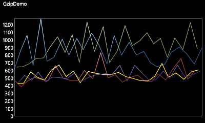
GzipDemo on Windows Phone

In the chart above, you can clearly see which requests are using gzip and which aren't! Not only are the gzip-enabled requests noticeably faster on average, they're nearly always faster even in the worst case. What's more, while there's variability for both kinds of requests (that's part of how the internet works), the delta between best/worst times of gzip-compressed requests is smaller (i.e., they're more consistent).

That's pretty compelling data, but the real benefit comes when the phone's data connection is used. Here's the output from the same app using the cell network (via Excel this time):
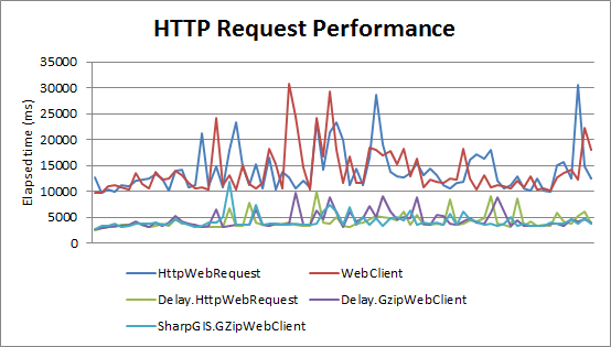
HTTP Request Performance

All our previous observations remain true - and are even more pronounced in this scenario. Gzip-compressed HTTP requests are significantly faster (taking less than half the time) and more predictable than traditional requests for the same data.

Awesome!

Aside: Based on the chart above, it seems reasonable to claim all three gzip solutions are equivalent. That said, if you squint just right, it looks like using HttpWebRequest is - on average - marginally quicker than using WebClient (as you'd expect; WebClient calls HttpWebRequest under the covers). Additionally, SharpGIS.GZipWebClient appears to be - on average - very slightly quicker than Delay.GzipWebClient (which is also not surprising when you consider the hoops my code jumps through to avoid the external dependency). Bear in mind, though, that these differences only really show up at the millisecond level, and seem unlikely to be significant for most real-world scenarios.


[Click here to download the source code for the gzip helper classes and the sample application shown above]

OR

[Click here to visit the NuGet gallery page for Delay.GzipWebClient which contains the code for both gzip helper classes]


Notes:

  • Using the code I've authored is quite easy:

    • If you want to use GzipWebClient, simply add the GzipWebClient.cs and GzipExtensions.cs files to your project, reference the Delay namespace, and replace any instances of WebClient.

    • If you're a HttpWebRequest/HttpWebResponse fan, you only need to add GzipExtensions.cs to your project, reference the Delay namespace, and invoke the extension methods HttpWebRequest.BeginGetCompressedResponse and HttpWebResponse.GetCompressedResponseStream (as shown above).

  • By default, the sample application does not include Morten's GZipWebClient because I don't want to get into the business of distributing someone else's code. However it's easy to include - the following comment in MainPage.xaml.cs tells you how:

    // For an additional scenario, un-comment the following line and install the "SharpGIS.GZipWebClient" NuGet package
    //#define SHARPGIS

    The code to use that assembly is already in the sample application; you just need to provide the bits if you want to try it out. :)

  • The implementation of the gzip-to-ZIP wrapper is fairly straightforward: it reads the gzip-compressed response from the server, wraps it in a stream that represents a valid ZIP archive with a single file compressed using the deflate algorithm which both specifications share, and hands that off to the Silverlight framework to return a decompressed stream for that file. To be clear, the compressed data isn't altered - it's simply re-packaged into a format that's more useful. :) If you're interested in the specifics, you'll probably want to familiarize yourself with the gzip specification and the ZIP file specification and then have a look at the code.

  • There are two minor inefficiencies in my code, one of which seems unavoidable and the other of which could be dealt with.

    • The unavoidable one - and the reason I think SharpZipLib might be a smidge quicker - is that the size/checksum data for the gzip data is provided at the end of the download stream, but is needed at the beginning of the wrapper stream. If the correct values aren't used, the ZIP wrapper will be rejected - but those values are not known until the entire response has been downloaded. Therefore, it's not possible for my implementation to proactively process the data while it is being downloaded; the download must be buffered instead. A decompression library won't suffer from this limitation and ought to be quicker as a result.

    • The avoidable inefficiency is that a single copy of the input data is made when creating the ZIP wrapper stream. To be clear, this is the only time data is copied (I've structured the code so there isn't any buffer resizing, etc.), but it's not technically necessary because the ZIP wrapper stream could operate directly from the download buffers. I may make this improvement in the future, but expect the performance difference to be negligible.


Compressing HTTP traffic is a pretty clear win for desktop applications - and an even bigger benefit for mobile apps communicating over slower, less reliable cellular networks. The Windows Phone platform doesn't make using gzip easy, but it's possible if you're sufficiently motivated. For people who aren't intimidated by licenses, there are already some good options for gzip - but for those who aren't comfortable with what's out there, I'm offering a new option under one of the most permissive licenses around.

I hope you find it useful!

ListPicker? I hardly even know 'er! [A detailed overview of the Windows Phone Toolkit's ListPicker control]

In yesterday's post, I announced the second release of the Silverlight for Windows Phone Toolkit and gave an overview of the four new controls it includes. (For a discussion of the controls in the original Windows Phone Toolkit, please see my announcement for that release.) In today's post, I want to focus on one of the new controls, ListPicker, and discuss it in detail.


The sample application associated with the official Windows Phone Toolkit download offers a great overview of the Windows Phone Toolkit controls, but (deliberately) doesn't get into specific detail on any of them. This post is all about details, so I've written a dedicated sample application which is the source of all the XAML snippets and screenshots below:

[Click here to download the complete source code for the ListPickerSamples application.]


Background

From my previous post:

ListPicker is the Windows Phone 7 equivalent of the ComboBox control: give it a list of items and it will show the selected one and also allowing the user to pick from a list if they want to change it. The core applications on Windows Phone 7 implement two kinds of list selection: an in-place expander for picking among five or fewer items, and a full-screen popup for picking among more. The Toolkit's ListPicker control combines both experiences into one handy package by automatically selecting the right UX based on the number of items in its list! It is a standard ItemsControl subclass with all the common elements of a Selector, so the API will be familiar to just about everyone. In fact, you can take most existing ListBoxes and convert them to ListPickers just by changing the control name in XAML!

That's the gist: ListPicker is the control of choice for selecting values in Windows Phone 7 applications. To be more explicit, it is most appropriate in "Settings"-like scenarios where the user is offered a variety of different options and it makes sense to display only the current value (with an option to show everything once the user decides to make a change). Conversely, ListPicker is not appropriate for displaying long lists of data that the user is going to scan and scroll; scenarios like the "People" or "Marketplace" applications are better served by a ListBox or the Windows Phone Toolkit's new LongListSelector.


Typical Use

The most common scenario for ListPicker looks something like this:

<StackPanel>
    <toolkit:ListPicker
        Header="Rating"
        ItemsSource="{Binding Ratings}"
        SelectedIndex="1"
        SelectionChanged="RatingSelectionChanged"/>
    <TextBlock
        x:Name="RatingSelection"
        CacheMode="BitmapCache"/>
    ...
</StackPanel>

Which gets displayed like this (in normal and expanded forms):

Typical example (normal) Typical example (expanded)

As you'd expect for an ItemsControl subclass, the ItemsSource property is used to provide the list of items (see also: the Items property). And as you'd expect for a Selector-like control, the SelectionChanged event is used to signal changes and the SelectedIndex property is used to get or set the selection (see also: SelectedItem). Everything so far looks just like ListBox - the only difference is the Header property which can optionally be used to provide a simple, platform-consistent label for the ListPicker that offers additional context about the control's purpose (see also: HeaderTemplate).

Aside: The built-in ListBox control will throw an exception if you set SelectedIndex as in the example above because it tries to apply the selection before the Binding has provided the list of items. ListPicker specifically handles this common scenario so you don't have to jump through hoops to make it work. :)


Custom Templates

Displaying strings is all well and good, but sometimes it's nice to display richer content:

Custom template (normal) Custom template (expanded)

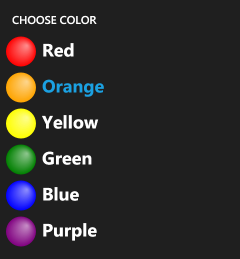
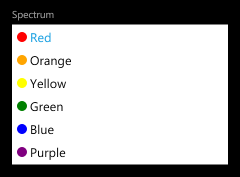
The first thing to do is set the ItemTemplate property as you would for ItemsControl or ListBox - that applies the specified DataTemplate to each item and formats it attractively in the usual manner. That works great, but what about ListPicker's Full mode that's used when the list has too many items? By default, the same ItemTemplate automatically applies there, too, so you may not need to do anything more! However, the Full mode UI uses the entire screen, so it's pretty common to want to specifically customize the appearance of the items for that mode. Therefore, the FullModeItemTemplate property lets you provide a different DataTemplate to be used in the Full mode scenario. Another relevant property for such cases is FullModeHeader which sets the content that's shown at the top of the full-screen "popup".

<toolkit:ListPicker
    Header="Spectrum"
    FullModeHeader="CHOOSE COLOR"
    ItemsSource="{Binding Rainbow}"
    ItemTemplate="{StaticResource RainbowTemplate}"
    FullModeItemTemplate="{StaticResource LargeRainbowTemplate}"/>


Threshold Overrides

By default, lists with five or fewer items expand in-place while lists with more items switch to a full-screen selection interface. This behavior matches the platform guidelines, but sometimes it might make sense to nudge the threshold one way or another (for very large or very small items, perhaps). You might even want to force a ListPicker to always use Expanded or Full mode...

Threshold (full) Threshold (expanded)

For these scenarios, there's the ItemCountThreshold property: it specifies the maximum number of items that will be displayed in Expanded mode. In addition to nudging it up or down a bit for custom scenarios, it can also be set to 0 to "always use Full mode" or a very large number to "always use Expanded mode". Granted, an application that forces Expanded mode for a list of 1000 items probably won't be easy to use - but the freedom is there to allow developers and designers to dial-in exactly the kind of experience they want.

<toolkit:ListPicker
    Header="Rating"
    FullModeHeader="CHOOSE RATING"
    ItemsSource="{Binding Ratings}"
    ItemCountThreshold="0"/>
<toolkit:ListPicker
    Header="Spectrum"
    ItemsSource="{Binding Rainbow}"
    ItemTemplate="{StaticResource RainbowTemplate}"
    ItemCountThreshold="100"/>


Two-Way Binding

Two-way binding

As you'd expect, ListPicker can be used with TwoWay Bindings as well. This is particularly convenient for the SelectedIndex/SelectedItem properties where it's common to want to set the initial value based on a data model (see also: MVVM) and/or when you want the model to update directly when selection changes. The corresponding XAML looks just how you'd expect:

<toolkit:ListPicker
    Header="Network"
    ItemsSource="{Binding Networks}"
    SelectedItem="{Binding CurrentNetwork, Mode=TwoWay}"/>
<StackPanel
    Orientation="Horizontal"
    Margin="{StaticResource PhoneMargin}"
    CacheMode="BitmapCache">
    <TextBlock Text="Current Network: "/>
    <TextBlock Text="{Binding CurrentNetwork}"/>
</StackPanel>


Tips and Tricks

At this point, I hope everyone knows how ListPicker works and has a good feel for when/where/why/how to use it. That being the case, there are a few additional things I'd like to draw attention to:

  1. The ListPicker philosophy is that "there is always an active selection", so it makes sure to select an item when it initializes or when the list changes. This automatic selection (of the first item in most cases) causes the SelectionChanged event to fire - and that causes the application's associated event handler to run (assuming one has been registered). In practice, this "initialization-time" event catches some people by surprise - but it's the intended behavior (and folks tend to agree it's correct once they understand why it happens). Now that you know about it, maybe your development experience will be a bit easier. :)

    Aside: If you want to ignore this event in code, it should be easy to detect because its SelectionChangedEventArgs.RemovedItems collection will be empty (have 0 items). And the only time that happens is when ListPicker is transitioning from an empty list to a non-empty one (e.g., on startup).
  2. ListPicker's transitions between Normal and Expanded mode are effectively animations of the control's Height. Because Height changes cause a layout pass, they don't take place on the composition thread and therefore are more susceptible to performance issues. An easy way to mitigate this in the typical "list of items in a StackPanel" scenario is to add CacheMode=BitmapCache to the elements that appear below the ListPicker (i.e., those that are pushed down by the animation). Please refer back to the first XAML snippet for an example - this tweak allows the Silverlight layout system to animate such controls as bitmaps and that helps the animation run a bit more smoothly.

    Aside: If you don't want to apply BitmapCache to every control individually, an alternate approach is to wrap the affected controls in another StackPanel and set the CacheMode property on the StackPanel instead. Please see the last XAML snippet above for an example of this.
  3. If you have a long list of controls in a StackPanel inside a ScrollViewer and there's a ListPicker near the bottom using Expanded mode, that expansion does not automatically scroll the screen to keep the ListPicker completely in view. On WPF, the fix would be a simple matter of calling FrameworkElement.BringIntoView. However, Silverlight doesn't have that API and there doesn't seem to be a good general purpose way for ListPicker to find the right parent to scroll. (Although walking up the visual tree to find the first ScrollViewer is probably right in most cases, it's not a sure thing; ListPicker errs on the side of caution and doesn't try to make guesses.) In practice, the underlying issue doesn't come up very often - when it has, my suggestion has been to use the ItemCountThreshold property to force the relevant ListPicker to use Full mode (which doesn't expand, so it doesn't alter the parent's layout, so it doesn't have this problem).


Summary

ListPicker is a relatively straightforward control that should be familiar to anyone who's used the standard ListBox. But while its API may be unremarkable, its user experience is all Windows Phone 7 goodness! :)

I hope you enjoy it!

Mo controls, mo controls, mo controls... [Announcing the second release of the Silverlight for Windows Phone Toolkit!]

I'm happy to report that we've just published the Silverlight for Windows Phone Toolkit November 2010 release! This is the second iteration of the Windows Phone Toolkit and effectively doubles the number of controls we've created to help developers and designers build more compelling, more platform-consistent user experiences with ease. The first Windows Phone Toolkit release has been a big hit and we've seen a lot of developers using it (in both binary and source forms) to build their Windows Phone 7 applications. But while we tried to address the most pressing needs with that release, there were still a couple of prominent controls missing...

With today's update, we've tried to provide more of the fundamental controls customers have been asking for - as well as API documentation and fixes for some of the bugs people reported with the first release. Recall that the Windows Phone Toolkit is published on CodePlex under the Ms-PL open-source license so anyone who wants can look at the source code to learn how we've done things - or customize any control to suit their specific scenario. As always, if you have suggestions for things we should add or change, please search the CodePlex issue tracker and vote for the issue (or create a new one if the idea is unique). We use your input to help prioritize our efforts and ensure we're delivering the right things for the community!


What's New?


ListPicker

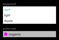
ListPicker sample ListPicker popup sample
<toolkit:ListPicker Header="background">
    <sys:String>dark</sys:String>
    <sys:String>light</sys:String>
    <sys:String>dazzle</sys:String>
</toolkit:ListPicker>

ListPicker is the Windows Phone 7 equivalent of the ComboBox control: give it a list of items and it will show the selected one and also allow the user to pick from a list if they want to change it. The core applications on Windows Phone 7 implement two kinds of list selection: an in-place expander for picking among five or fewer items, and a full-screen popup for picking among more. The Toolkit's ListPicker control combines both experiences into one handy package by automatically selecting the right UX based on the number of items in its list! It is a standard ItemsControl subclass with all the common elements of a Selector, so the API will be familiar to just about everyone. In fact, you can take most existing ListBoxes and convert them to ListPickers just by changing the control name in XAML!


LongListSelector

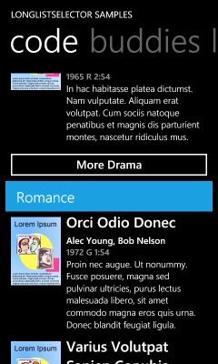
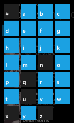
LongListSelector movies sample LongListSelector people sample LongListSelector jump-list sample
<toolkit:LongListSelector
    ItemsSource="{StaticResource movies}"
    ListHeaderTemplate="{StaticResource movieListHeader}"
    GroupHeaderTemplate="{StaticResource movieGroupHeader}"
    GroupFooterTemplate="{StaticResource movieGroupFooter}"
    GroupItemTemplate="{StaticResource groupItemHeader}"
    ItemTemplate="{StaticResource movieItemTemplate}">
</toolkit:LongListSelector>

While ListPicker is about simple selection scenarios, LongListSelector is about advanced ones! Think of it as ListBox++--, it has everything you expect from ListBox plus a bunch of advanced capabilities and great on-device performance minus the levels of abstraction and generality that tend to slow ListBox down. LongListSelector supports full data and UI virtualization, flat lists, grouped lists (with headers!), and also implements the "jump list" header navigation UI that makes the "People" app so efficient! The theory behind LongListSelector is that it should be easy to fix a poorly-performing ListBox scenario by swapping in a LongListSelector instead: it handles all the tricky parts for you, so there's less to worry about and it "just works". Unless you've spent a lot of time fine-tuning your application's list behavior, you should see improved performance by switching to LongListSelector!


TransitionFrame (and Transitions)

TransitionFrame sample
RootFrame = new TransitionFrame();
<toolkit:TransitionService.NavigationInTransition>
    <toolkit:NavigationInTransition>
        <toolkit:NavigationInTransition.Backward>
            <toolkit:TurnstileTransition Mode="BackwardIn"/>
        </toolkit:NavigationInTransition.Backward>
        <toolkit:NavigationInTransition.Forward>
            <toolkit:TurnstileTransition Mode="ForwardIn"/>
        </toolkit:NavigationInTransition.Forward>
    </toolkit:NavigationInTransition>
</toolkit:TransitionService.NavigationInTransition>
<toolkit:TransitionService.NavigationOutTransition>
    <toolkit:NavigationOutTransition>
        <toolkit:NavigationOutTransition.Backward>
            <toolkit:TurnstileTransition Mode="BackwardOut"/>
        </toolkit:NavigationOutTransition.Backward>
        <toolkit:NavigationOutTransition.Forward>
            <toolkit:TurnstileTransition Mode="ForwardOut"/>
        </toolkit:NavigationOutTransition.Forward>
    </toolkit:NavigationOutTransition>
</toolkit:TransitionService.NavigationOutTransition>

The Windows Phone UI Guidelines encourage smooth, attractive page-to-page animations like the core applications show, but there has been little platform support for creating similar experiences in your own applications - until now! :) The new transition classes in the Windows Phone Toolkit aims to make it easy for application developers to add attractive, platform-consistent transitions to their applications. All that's necessary to enable transitions for an application's pages is tweak App.xaml.cs (shown above) and add a bit of XAML to each page to specify its transitions (also shown above). Everything else is done for you!

Aside: This release includes support for multiple flavors of the following transitions: turnstile, slide, rotate, swivel, and roll. It's also possible to implement custom transitions using the same framework!


AutoCompleteBox

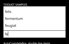
AutoCompleteBox sample
<toolkit:AutoCompleteBox
    ItemsSource="{StaticResource words}"/>

AutoCompleteBox first appeared in the Silverlight 2 Toolkit, then later graduated to the Silverlight 3 SDK. Now it's back in the Toolkit - this time for Windows Phone 7! Because phones are about being small and quick to use, simplifying tedious tasks like text input is an important goal. Toward that end, a number of the core applications (like Bing search) make use of auto-completion to predict what the user is typing and save time by allowing them to click on the completed word instead. AutoCompleteBox makes it easy to bring the same convenience to your own applications by taking advantage of a phone-friendly implementation of this popular Silverlight control. By providing a suitable completion list (in any of a variety of ways), users are automatically prompted with the relevant matches as they start typing!


API Documentation

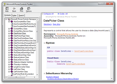
CHM file example

The source code for the Windows Phone Toolkit has included full XML Documentation Comments from the beginning, but now we've begun generating a separate CHM file with all the property/method/event comments in a single, easy-to-browse location. The documentation file is automatically installed by the Windows Phone Toolkit installer and a handy link is added to the "Silverlight for Windows Phone Toolkit" folder in the Start Menu. Because we don't have dedicated documentation writers on the Toolkit team, our documentation is a bit on the terse side - but the CHM file is still a great way to survey the Toolkit classes and get a feel for what's available. And because the sample syntax is available in both C# and VB, everyone should be comfortable with the examples!


Bug fixes for existing controls

The previous Toolkit release wasn't all that long ago and we've been quite busy since then, but we've still managed to squeeze in fixes for some of the more annoying bugs customers reported. That's not to say that we fixed them all or that we had a chance to squash your favorite bug, but we were fortunate to be able to fix a good number of customer-impacting issues and I hope everyone finds the new controls even more pleasant to use! :)


[Click here to download the Silverlight for Windows Phone Toolkit November 2010 release.]


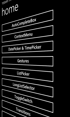
The screen shots and XAML shown above are all from the sample application you can download along with the Toolkit. I encourage people to play around with the sample if they want to experiment with any of these controls (in the emulator or on the device) or if they want to learn more about how these controls work. I anticipate more in-depth coverage will show up in the coming weeks (I will be posting a detailed ListPicker overview tomorrow!), but for now the sample application is a great springboard to get folks started!


In closing, I'm really glad we've been able to get this second round of controls out to the community in such a short time! While there are probably still some "nice to have" controls that could be added to further round-out the Windows Phone 7 control offering, I think that what we've included in the Windows Phone Toolkit represents nearly all the critical ones needed to unblock important scenarios. I hope people continue to enjoy their Windows Phone development experience and that the new Windows Phone Toolkit makes application development even easier! :)

Pining for Windows Phone 7 controls? We got ya covered! [Announcing the first release of the Silverlight for Windows Phone Toolkit!]

Phone Toolkit Sample Application

Today marks the official release of the Windows Phone Developer Tools. This free download enables anyone to create .NET applications for the Windows Phone 7 platform using the Silverlight framework (for traditional applications) or the XNA framework (for games). The Windows Phone 7 application development experience is fully integrated with Visual Studio 2010 and Blend 4 and also includes an emulator for running and testing applications without having a phone. It's really cool stuff, and I encourage everyone to learn more about Windows Phone 7 development!

Congratulations to the Windows Phone 7 team on their accomplishment!


To celebrate, there's a new download for the Silverlight Toolkit CodePlex project: the Silverlight for Windows Phone Toolkit September 2010 release! Yes, that's right - in addition to providing controls for Silverlight developers targeting the desktop, we're also providing controls for Silverlight developers targeting Windows Phone 7! As you might guess, the Windows Phone Toolkit is a lot like the Silverlight Toolkit: the goal is still to provide a set of controls that complement the platform's core offering and help developers/designers create more compelling, more platform-consistent user experiences simply and easily. Because we focus on writing solid, reusable controls that address common scenarios, you are free to focus on delivering an engaging, compelling application to your customers!

As with the Silverlight Toolkit, the Windows Phone Toolkit comes with full source code (under the permissive OSI-approved Ms-PL license) to help people learn the techniques behind developing rich, platform-consistent controls, to see how we solved a particular problem, or to make tweaks and improvements to the controls themselves! The idea is to publish the Windows Phone Toolkit every few months or so; each release will include new controls, improvements to existing controls, and fixes for any bugs people run into. If you have a suggestion for something we should add or change, please search for that issue in the CodePlex issue tracker and vote for it (or create a new issue if your idea is unique). We pay attention to the number of votes an issue has when prioritizing our efforts - it helps ensure we're delivering what the community wants!


Okay, after all that intro and background, you're probably wondering what's actually in the Phone Toolkit... :)


What's in the Phone Toolkit?

ContextMenu and ContextMenuService

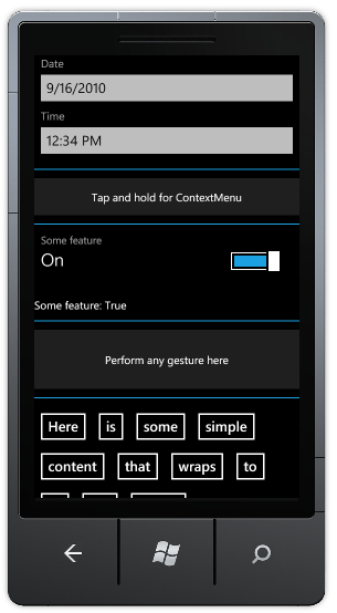
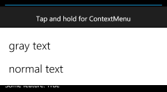
ContextMenu sample

In desktop applications, ContextMenu is handy because it lets the second mouse button perform additional, contextually-relevant tasks; but on the phone, it's practically a requirement! Phone-sized UIs need to use every pixel to its fullest advantage, so being able to hide secondary commands behind a tap+hold gesture is a great way to keep the interface clean and easy to read.

The Windows Phone Toolkit's ContextMenu control is a direct port of the Silverlight 4 Toolkit's ContextMenu (read more about what it does and how it works here) with additional Windows Phone-specific functionality added on top. So the Phone ContextMenu uses the same, great 100% Silverlight- and WPF-compatible ItemsControl-based API you know and love - plus it looks good on the phone and behaves just like the system's ContextMenu does! Which means ContextMenu (along with its helper ContextMenuService) is simple to use and makes it easy for Windows Phone applications to maintain platform-consistent appearance and behavior. (And for advanced scenarios, ContextMenu supports the ICommand interface, data-binding (of and to) items, Separator, and more!)

Here's the XAML for the example above:

<Border
    Background="{StaticResource PhoneChromeBrush}"
    Padding="20">
    <toolkit:ContextMenuService.ContextMenu>
        <toolkit:ContextMenu>
            <toolkit:MenuItem
                Header="gray text"
                Click="MenuGrayTextClick"/>
            <toolkit:MenuItem
                Header="normal text"
                Click="MenuNormalTextClick"/>
        </toolkit:ContextMenu>
    </toolkit:ContextMenuService.ContextMenu>
    <TextBlock
        x:Name="MenuTextBlock"
        Text="Tap and hold for ContextMenu"
        HorizontalAlignment="Center"/>
</Border>


DatePicker and TimePicker

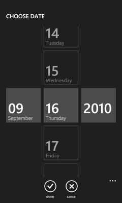
DatePicker and TimePicker sample buttons DatePicker and TimePicker sample picker

Windows Phone 7 includes a cool, distinctive UI for choosing dates and times: three vertical spinners create a fun "endless looping" experience that people really enjoy using. The Phone Toolkit's DatePicker and TimePicker controls implement the exact same experience as the core controls, so it's easy to add date and time selection to your own application!

What's more, these controls are both culture-aware and automatically configure themselves according to the settings on the user's phone (ex: d/m/y vs. m/d/y date formats and 12- vs. 24-hour time format). The API for DatePicker and TimePicker will be familiar to anyone who's used similar "picker" controls in the past. The Header convenience property simplifies the task of labeling either control - in a platform-consistent font and style!

Here's the XAML for the example above and to the right:

<toolkit:DatePicker
    Header="Date"
    Value="9/16/2010"
    ValueChanged="DatePickerValueChanged"/>
<toolkit:TimePicker
    Header="Time"
    Value="12:34 pm"
    ValueChanged="TimePickerValueChanged"/>


ToggleSwitch

ToggleSwitch sample

The Windows Phone UI for toggling settings on and off will be immediately familiar to anyone who's used a light switch (or an iDevice). Because there are subtleties to the core controls that are tricky to get right, the Toolkit includes the ToggleSwitch control! Continuing the theme of "make it easy to match the core behavior", ToggleSwitch looks, feels, and acts just like Windows Phone users will expect - including supporting flicks and swipes. In addition to subclassing ToggleButton for consistency and usability, ToggleSwitch supports the Header convenience property to make it easy to create properly-spaced settings pages. And if the need arises, you can also provide custom Content or pull the ToggleSwitchButton primitive control out and use it directly!

Here's the XAML for the example above:

<toolkit:ToggleSwitch
    Header="Some feature"
    IsChecked="true"
    Checked="ToggleSwitchChanged"
    Unchecked="ToggleSwitchChanged"/>


GestureListener and GestureService

GestureService and GestureListener sample

Touch interfaces are a lot more interactive and engaging than the conventional mouse+keyboard UI most people are used to. One of the neatest things about touch UIs are their ability to translate natural human gestures into meaningful commands. Taking good advantage of touch and gestures can significantly improve the user experience and really help an application stand out from the crowd.

To make gestures easy to work with, the Phone Toolkit includes the GestureService and GestureListener classes which provide events for the following gestures: tap, double-tap, hold, flick, drag (started/delta/completed), and pinch (started/delta/completed). All these gestures respect the relevant system parameters (ex: movement threshold, input timing, etc.), so applications that use GestureListener feel familiar and natural. All the developer needs to do is associate a GestureListener with the element(s) of interest and handle the corresponding gesture event(s) as they show up!

For more background on gestures, here's a nice, easy to visualize overview for Windows 7 (not identical, but close) and here's a detailed document specific to windows Phone 7.

Here's the XAML for the example above (note that typical applications will only hook up to the event(s) they care about):

<Border
    Background="{StaticResource PhoneChromeBrush}"
    Padding="40">
    <toolkit:GestureService.GestureListener>
        <toolkit:GestureListener
            Tap="GestureListenerTap"
            DoubleTap="GestureListenerDoubleTap"
            Hold="GestureListenerHold"
            Flick="GestureListenerFlick"
            DragStarted="GestureListenerDragStarted"
            DragDelta="GestureListenerDragDelta"
            DragCompleted="GestureListenerDragCompleted"
            PinchStarted="GestureListenerPinchStarted"
            PinchDelta="GestureListenerPinchDelta"
            PinchCompleted="GestureListenerPinchCompleted"/>
    </toolkit:GestureService.GestureListener>
    <TextBlock
        x:Name="GestureTextBlock"
        Text="Perform any gesture here"
        HorizontalAlignment="Center"/>
</Border>


WrapPanel

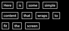
WrapPanel sample

It may not be the sexiest of the Panel classes, but WrapPanel is a tremendously useful layout container! Lots of Windows Phone developers have been using this control from the Silverlight 3 Toolkit (either by referencing that assembly or by copying the code into their projects), but that can be a little tricky - so we thought we'd make it super easy by including WrapPanel in the Phone Toolkit! WrapPanel's "put as much stuff on a line as fits, then wrap to the next line" approach works particularly well on the phone - especially for scenarios where the sizes of things can vary (ex: during the transition from portrait orientation to landscape).

Here's the XAML for the example above:

<toolkit:WrapPanel>
    <Button Content="Here"/>
    <Button Content="is"/>
    <Button Content="some"/>
    <Button Content="simple"/>
    <Button Content="content"/>
    <Button Content="that"/>
    <Button Content="wraps"/>
    <Button Content="to"/>
    <Button Content="fit"/>
    <Button Content="the"/>
    <Button Content="screen"/>
</toolkit:WrapPanel>


[Click here to download the sample application used to create all the examples shown here.]


Helpful Hints for Hopeful Heroes

Here are a few tips and tidbits to help fledgling Windows Phone 7 developers make the most of the Phone Toolkit:

  • The examples I show here are from my own (deliberately simple) sample application, but there's also a more comprehensive sample application that shows off more sophisticated scenarios. The complete source code for the entire Phone Toolkit (including the sample application) can be downloaded from the CodePlex release page or the CodePlex source code page or by using any of the supported version control system clients (ex: TFS, SVN, etc.).

  • Some (but not all) of the ContextMenus used by the core phone applications get a little fancy when they show the menu: they shrink the UI of the rest of the application in the background. Because we strive to help developers create consistent applications, the Toolkit's ContextMenu does this by default as well.

    But because it's not part of the application itself, our ContextMenu's behavior needs to be as self-contained as possible - which means it can not modify the existing visuals in order to create this effect. (Otherwise it might make an unexpected change that crashes the developer's application!) Therefore, the "shrink" effect is implemented by capturing a "background" screen shot of the entire application, layering it over an opaque PhoneBackgroundBrush layer to avoid transparent areas leaking through, creating a "active element" screen shot capture of just the element that was tap+held, layering this over a correspondingly-sized opaque PhoneBackgroundBrush layer (to avoid transparency issues again), creating a "menu" layer for the actual menu items, layering everything over the running application by putting it in a Popup, and finally animating the scale of the "background" layers. Whew - if that sounds like a lot of effort, it is... :)

    The good news is this works pretty well in practice and duplicates the core effect fairly authentically - the less good news is that certain page designs poke little holes in the sleight-of-hand ContextMenu is doing. In many cases, such issues can be resolved by modifying the target element (the one to which the ContextMenu is attached) to have a non-transparent background. (ContextMenu's PhoneBackgroundBrush guess is the best it can do, but the application developer can sometimes do better.)

    But if you still can't get the effect you're looking for - or if you just don't like the default "shrink and grow" behavior (the core applications don't use it everywhere, either!) - then you can set the (Phone-specific) ContextMenu.IsZoomEnabled property to false in order to disable the custom animation and get rid of all this goofy complexity. In every case I know of so far, developers who resorted to IsZoomEnabled were quite happy with the results! :)

  • Icon configuration When you first add DatePicker or TimePicker to your application, you'll find that the "done" and "cancel" ApplicationBar icons shown when the pickers are opened are wrong. That's because the icons aren't actually being loaded - and that's because of a platform restriction. Specifically, the ApplicationBarButton.IconUri property will only load images that are part of the project and marked with Build Action=Content in the property editor. This means there's no good way for an assembly like the Phone Toolkit assembly to bundle such icons within itself (like there would be if the IconUri property supported the assembly-relative syntax "/assemblyShortName;component/resourceLocation").

    As a result, it's necessary for application developers to add these two icons to a well-known path in their project where DatePicker and TimePicker will automatically use them. For your convenience, we've bundled these two icons along with the Toolkit installer and they're already on your machine! :) To find them, open the Start Menu, expand the "Microsoft Silverlight for Windows Phone Toolkit" folder, and click on the "Binaries" item. This will open a Windows Explorer view of the install location of the Phone Toolkit (something like C:\Program Files\Microsoft SDKs\Windows Phone\v7.0\Toolkit\Sep10\Bin). The icons can be found in the "Icons" sub-folder within.

    To use these two icons in an application, right click the application's project node in the Visual Studio Solution Explorer, choose "Add", choose "New Folder", and rename it "Toolkit.Content". Then right-click on the new folder, choose "Add", choose "Existing Item...", navigate to the Phone Toolkit's install directory, select both icons, and hit "OK". Right-click each icon and change its "Build Action" to "Content"; re-run the application, and they'll show up just like you expect! (And if any of that seemed confusing, just look at how the sample application is configured - match that and you'll be fine.)

  • If you already know Windows Phone 7 supports different themes ("Light" and "Dark", AKA "white background" and "black background"), you might wonder why it's not necessary to provide "Light" and "Dark" versions of each icon... Well, the platform's a little clever here - it will automatically "Light"-ify "Dark" icons when the "Light" theme is active. Therefore, all we need to do is provide is "Dark" versions of the icons - the system converts them for us!

    Note: The reverse is not true; "Light" icons will not be "Dark"-ified for you. (So it seems like maybe the "Dark" side is more powerful?)
  • We've already discussed the reasons why it's good for controls to use the Popup control (because it keeps things isolated from the rest of the application), so DatePicker and TimePicker obviously use Popup too, right? Wrong! :)

    To be fair, DatePicker and TimePicker originally used a Popup for exactly those reasons. And life was good. Except when you tried to scroll the time/date spinners in the picker view... It worked okay, but the frame-rate was pretty low - almost as if the animations weren't happening on the composition (render) thread like they were supposed to... And, indeed, they weren't! It turns out the phone platform doesn't apply hardware acceleration to content in a Popup. :(

    Enough people were unhappy with the performance that DatePicker and TimePicker were modified to use a PhoneApplicationPage-based model instead. What this means is that instead of opening a Popup to hold the picker's spinner UI, these controls instead call NavigationService.Navigate("...") and point it to a Page subclass that's hosted in the same control assembly. The platform doesn't care where it loads pages from, so it happily navigates to the new Page, which then loads the spinners, which benefit from hardware acceleration, and therefore scroll smoothly!

    If this sounds like a wonderful solution, that's because it is - mostly. The big drawback to the Page-based approach is that it subtly breaks one of the guidelines of control development we discussed above: don't make changes that affect the application. In this case, if the application is already listening to the NavigationService's Navigating or Navigated events, then it will also see the "hidden" navigations that DatePicker and TimePicker are performing.

    Whether this is a problem or not depends on what the application is doing and how it's doing it. The good news is that most applications don't track navigations and won't need to worry about this at all; for applications that do track navigations, the good news is that this scenario is easy to detect. Specifically, if the object exposed by NavigationEventArgs.Content during a navigation implements IDateTimePickerPage, then the current navigation is part of DatePicker or TimePicker's behavior and should be ignored by the application. Applications that follow that simple guideline should be safe; applications that ignore it and play tricks like cancelling DatePicker and TimePicker navigations will most likely break stuff. :(

  • Now that I've thoroughly scared everyone away from ever using Page-based navigations, let me back-pedal a bit and say that there are some cool things you can do with them! In particular, DatePicker and TimePicker allow you to customize their destination Page which lets you completely change the picker experience for both of them. But I've already gone on long enough here; that'll be the topic of a subsequent blog post... :)


We've had a lot of fun building the Silverlight for Windows Phone Toolkit - and we hope you have a lot of fun using it! Everything in the Phone Toolkit is there because there was strong customer demand. The Silverlight Toolkit team has heard you loud and clear, and we're doing our best to make your Windows Phone 7 development experience as pleasant and productive as possible!

Okay, enough chatter for now - go download the developer tools and get busy building great applications! :)

Your phone can turn into a robot [LayoutTransformer works great on the Windows Phone platform]

The WPF platform offers RenderTransform and LayoutTransform. Silverlight - being considerably smaller and a bit simpler - has only RenderTransform. Which is usually enough - except when it's not! :)

So I wrote LayoutTransformControl a while back in order to bring LayoutTransform to the Silverlight platform. It was so useful/popular that we included it in the Silverlight Toolkit with the name LayoutTransformer [insert robot sounds here]. That post includes links to a bunch of my posts about LayoutTransformControl/LayoutTransformer, but the most important one for newcomers is probably the original "motivational" post.


Here's the relevant portion:

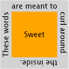
People who want to rotate visual elements in Silverlight are likely to use RotateTransform within RenderTransform - but they may not always get the results they expect! For example, using RenderTransform to achieve the following effect:

Sweet

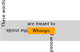
Actually renders like this:

Whoops

But the problem isn't with RenderTransform - it's with using the wrong tool for the job! By design, RenderTransform applies its transformations (a rotation in this case) after the layout system has performed its measure/arrange pass. So when the elements in the example are being measured and arranged, the text is still horizontal. It's only after everything has been positioned that the text is finally rotated - and ends up in the "wrong" place. While it's possible to correct for this discrepancy by hard-coding all the relevant offsets in the XAML (very brittle and error-prone) or by adjusting all the offsets in code (only slightly more flexible - and a lot more work), these aren't great alternatives.

The right tool for the job is LayoutTransform which applies its transformations before the layout pass. With LayoutTransform, the text in the example is already rotated by the time the elements are measured and arranged, and the desired effect can be achieved quite simply.

But there's a catch: LayoutTransform doesn't exist in Silverlight [and therefore Windows Phone]...

However, there's no reason to let that stop us. Rotation is rotation whenever it happens, so maybe there's a way to get the already-optimized RenderTransform implementation to do the real work earlier in the layout pass...


Lately, I've been contacted by a number of customers asking if LayoutTransform worked in Windows Phone applications or having trouble referencing it from the relevant Silverlight 3 Toolkit assembly. So I figured it would be good to verify this for myself and make it even easier for people to use!

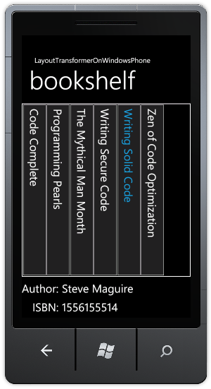
There are lots of compelling scenarios for LayoutTransform, but the most common is definitely rotating text and images. So here's my simple "bookshelf" sample which highlights a few of my favorite programming books:

LayoutTransformer on Windows Phone

The tricky part of creating a layout like this without LayoutTransformer would have been getting those vertical book titles aligned properly on the spines of those books without hardcoding a bunch of positioning data (which would have broken as soon as anyone touched the XAML). But LayoutTransformer makes this a piece of cake - just wrap the content, rotate it, and everything automatically works just how you'd expect it to! You can change font sizes, margins, alignment - whatever - and never have to worry about your layout going funky.


[Click here to download the complete LayoutTransformerOnWindowsPhone sample and pre-compiled assembly]


When you're ready to add LayoutTransformer to your own application, just add a project reference to the LayoutTransformer.dll assembly (found in the root of the ZIP download) and add the appropriate XMLNS to the top of your XAML:

xmlns:toolkit="clr-namespace:System.Windows.Controls;assembly=LayoutTransformer"

After that, wrap anything you want in a LayoutTransformer and apply the relevant transforms. Here's what the sample uses:

<toolkit:LayoutTransformer>
    <toolkit:LayoutTransformer.LayoutTransform>
        <RotateTransform Angle="90"/>
    </toolkit:LayoutTransformer.LayoutTransform>
    <Border
        BorderBrush="{StaticResource PhoneForegroundBrush}"
        BorderThickness="1">
        <TextBlock
            Text="{Binding Title}"
            Margin="10"/>
    </Border>
</toolkit:LayoutTransformer>


Yep, it's really that easy!


PS - There's a bug in the default templates of the Windows Phone Developer Tools Beta that makes the books show up with different heights. That problem has been fixed in more recent Tools releases (as demonstrated by the screen capture above), so don't worry when you see that on the Beta - it has nothing to do with LayoutTransformer. :)

My new home page, rejuvenated [Updated collection of great Silverlight/WPF/Windows Phone Data Visualization resources!]

It's been a few months since I posted my previous collection of Silverlight/WPF Charting links. In the meantime, the April 2010 release of the Silverlight Toolkit was published with support for stacked series and significant performance improvements! And Windows Phone 7 has been steadily building momentum - it's handy that the Data Visualization assembly also works on Windows Phone!

So there's lots of good stuff - here are all the links (FYI: previously published links are gray):

Overviews (100 level)

Scenarios (200 level)

Internals (300 level)

Team Member posts (Partner level)

My posts (Ego level)

Many thanks go out to everyone who has spent time helping people learn how to use Silverlight/WPF/Windows Phone Data Visualization!

PS - If I've missed something useful, please send me a link - I'm always happy to find more great content! :)

PPS - The most recent version of this collection will always be pointed to by http://cesso.org/r/DVLinks. If you're going to create a favorite or link to this post, please use that URL so your link will always be current.

Why didn't I think of that in the first place? [Windows Phone 7 Charting example updated to include reusable, platform-consistent Style and Templates]

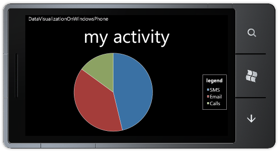
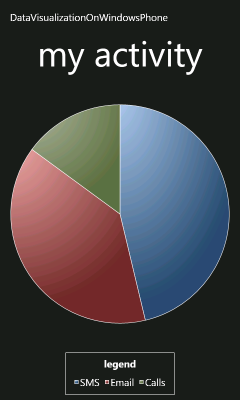
I've previously blogged about how to get the Data Visualization assembly from the Silverlight Toolkit/WPF Toolkit working on Windows Phone. It's quite simple with my Data Visualization Development Release 4 and the Windows Phone Developer Tools Beta because it's now as easy as adding a reference to two assemblies and then creating some charts! However, those charts start out with visuals meant for use with Silverlight running in the web browser (white background, etc.), not Silverlight running on Windows Phone (black background, etc.). One of the things I did in a previous post was to customize the appearance of the sample charts so they fit in better with the phone conventions. Because Charting has come up quite a bit with customers lately, I wanted to do a quick follow-up to help make things even easier to use!


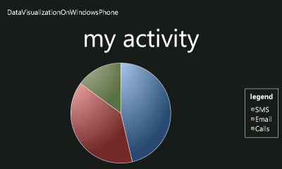
Sample in landscape orientation


Accordingly, I've made the following improvements to the DataVisualizationOnWindowsPhone sample:

  • Created the PhoneDataVisualizationResources.xaml file. It contains a ResourceDictionary with PhoneChartStyle, PhoneChartPortraitTemplate, and PhoneChartLandscapeTemplate. These are the same basic custom customized Style and ControlTemplates from before, but now they're named according to the platform convention for resources and bundled in a single, self-contained XAML file. This makes it easy for customers to incorporate the Windows Phone look into their charting applications.
  • Modified the sample to merge the contents of PhoneDataVisualizationResources.xaml into the application-level ResourceDictionary via MergedDictionaries in App.xaml:
    <Application.Resources>
        <!-- Merge resources from PhoneDataVisualizationResources.xaml (Build Action=Page) -->
        <ResourceDictionary>
            <ResourceDictionary.MergedDictionaries>
                <ResourceDictionarySource="/DataVisualizationOnWindowsPhone;component/PhoneDataVisualizationResources.xaml"/>
            </ResourceDictionary.MergedDictionaries>
        </ResourceDictionary>
    </Application.Resources>
    With the customizations now located off in their own dedicated file, the Chart in MainPage.xaml is simple and uncluttered:
    <charting:Chart
        x:Name="myChart"
        Title="my activity"
        LegendTitle="legend"
        Style="{StaticResource PhoneChartStyle}">
        <!-- ... -->
    </charting:Chart>
  • Changed the fills for DataPoints to use a solid color instead of a gradient. The default Brush used to paint the inside of data points has a gradient effect which looks quite nice on the desktop, but that gradient exhibits noticeable color banding on the actual phone because the displays used for mobile devices are often incapable of displaying the full range of colors humans perceive. While it's possible to minimize the impact of this by dithering (here's a nice article that shows how), you don't get that for free. Because gradients aren't consistent with the "Metro" user interface guidelines anyway, I've made all the default colors solid (as seen in the image at the start of the post).
  • Switched to using standard phone resources (ex: PhoneForegroundBrush) where applicable so Charts automatically respect the current phone appearance. Specifically, this enables seamless support for the "Dark" and "Light" phone themes without any effort on the part of the developer/designer.
  • Customized the Legend Template to include a horizontal scroll bar when rendered (horizontally) in Portrait orientation. The default Legend for Landscape orientation already had a vertical scroll bar, so this change makes it possible to scroll long lists in both layouts.
  • Switched to the official Silverlight 3 System.Windows.Controls.dll assembly now that the platform supports using strongly-named assemblies.


[Click here to download the updated Windows Phone 7 Data Visualization sample application.]


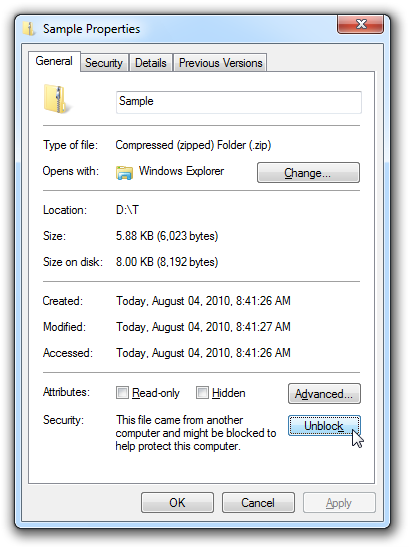
Important: After downloading the ZIP file above, you should "unblock" it before extracting its contents to avoid warnings from Visual Studio: Security Warning, You should only open projects from a trustworthy source. and The "ValidateXaml" task failed unexpectedly. System.IO.FileLoadException: Could not load file or assembly .... Unblocking is a simple matter of right-clicking on the ZIP file, choosing Properties from the context menu, then clicking the "Unblock" button in the lower, right-hand corner of the resulting dialog and hitting "OK" or "Apply":

Unblock button in Properties dialog

New phone bits, same pretty charts [Upgraded my Windows Phone 7 Charting example for the Windows Phone Developer Tools Beta]

The recent release of the Windows Phone Developer Tools Beta introduces a variety of notable changes to the Windows Phone platform and I've been meaning to update my Data Visualization on Windows Phone sample so I could continue to refer people to it for educational purposes. (Just like I did when the April Tools Refresh came out.) I finally got some time and have updated the sample so it targets the Beta Tools and works "out of the box".


Sample in portrait orientation Sample in landscape orientation


[Click here to download the updated Windows Phone 7 Data Visualization sample application.]


Rather than relying on an automated project upgrade, I simply diff-ed the existing project against a new project I created width the Beta Tools and made the necessary changes myself in Notepad. It was all pretty straightforward - here are the things that stood out for me:

  • App.xaml.cs: There's a lot more initialization code by default.
  • App.xaml: There's no longer a need to bake all those phone-specific styles into every application, so the default App.xaml is nearly empty (like it should be)! Also, the new PhoneApplicationService events are hooked up by default.
  • SplashScreenImage.jpg: An appropriately-named splash screen is now created and used automatically.
  • MainPage.xaml: The platform-specific Phone* assemblies and default namespaces have shifted around a bit. SupportedOrientations is now set in XAML instead of code.
  • DataVisualizationOnWindowsPhone.csproj: The WINDOWS_PHONE symbol is now #define-ed by default, giving shared code now a standard way of detecting the Windows Phone platform. The phone assembly references are slightly different and the splash screen is included by default.
  • WMAppManifest.xml: The property PlaceHolderString on the DefaultTask element has been renamed.

While I was at it, I also tweaked the way the data source is created (by making it a class and moving it to the Resources section) so now the charts show up at design-time, too. I'm using the exact same System.Windows.Controls.DataVisualization.Toolkit.dll and System.Windows.Controls.dll assemblies as before (see notes 4 and 5 of the previous post for more context) - though there should no longer be a need to "un-sign" the Silverlight Toolkit assembly to use it on Windows Phone.


This was all pretty basic stuff and it's important to note that none of the application code was affected. Changes like this are a natural part of the platform and project templates maturing - and it's great to see improvements like the default styles moving into the platform!

Banana SplitButton [A WPF-specific fix for SplitButton and some code analysis improvements for the Silverlight version, too]

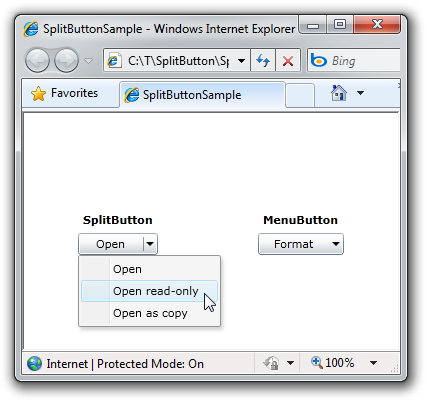
I've previously written that one of my ContextMenu test cases for the April '10 release of the Silverlight Toolkit was to implement a quick "split button" control for Silverlight using Button and ContextMenu. Though it wasn't my goal to build a general-purpose control for widespread use, there's been a lot of interest in SplitButton/MenuButton and I followed up with a few fixes for the Silverlight version and "official" support for WPF.


SplitButton and MenuButton


That might have been the end of the story - until Fabio Buscaroli contacted me to report an issue he was seeing with the WPF version (follow our exchange here). At first, I thought the problem was related to the DataContext not inheriting properly - and while that was true, it wasn't the whole story! When Fabio told me the tweak for DataContext I'd suggested didn't solve his RoutedCommand scenario, I had a look at a simple example he posted and realized the DataContext problem was a symptom of a larger issue: that the ContextMenu wasn't a logical child of the SplitButton. As soon as I solved that problem, it fixed Fabio's scenario and the related DataContext issue I'd discovered during my own investigation.

Aside: None of this applies to Silverlight because that platform doesn't expose the notion of a logical tree the way WPF does.


While I was working on this fix, I noticed full code analysis wasn't enabled for the SplitButton assemblies; I turned it on and addressed the handful of warnings it generated. Most of the changes won't matter to you, but one of them will: the namespace for SplitButton/MenuButton has changed. These classes now live in the Delay namespace - which is consistent with the rest of the sample code I post to my blog. Upgrading existing projects to the latest code will require a tweak of the XAML's "xmlns:" prefix and/or a tweak of the code's "using" statements. Otherwise, there have been no behavior changes to the functionality of SplitButton on Silverlight or WPF, so everything else should continue to work the same as before.


[Click here to download the complete Silverlight/WPF source code for SplitButton/MenuButton and the sample application shown above.]


It's been great to see the positive response SplitButton and MenuButton have generated. Thanks for everyone's help trying these controls out, finding issues, and reporting them!

SplitButtoning hairs [Two fixes for my Silverlight SplitButton/MenuButton implementation - and true WPF support]

One of my ContextMenu test cases for the April '10 release of the Silverlight Toolkit (click here for the full write-up) was to implement a quick "split button" control for Silverlight using Button and ContextMenu. In that post, I cautioned that my goal at the time was to do some scenario testing, not to build the best SplitButton control ever. However, what I came up with seemed to work pretty well in practice and I figured folks could probably use the code mostly as-is.

And it seems like they did - because I got two bug reports in that post's comments section! :)

SplitButton and MenuButton


Let me address them in reverse order:

The position of the ContextMenu was wrong when the browser is zoomed: True enough - though I'm going to ask for a bit of leniency here because the cause of the misalignment is actually a bug in Silverlight (which I've already reported). It seems the results of a call to element.TransformToVisual(Application.Current.RootVisual) or element.TransformToVisual(null) are not consistent for elements that are vs. are not inside a Popup control when the browser is zoomed (in or out). As a result, the SplitButton code to position the menu got inconsistent data and was unable to place the menu correctly. I've tweaked the code slightly to accommodate the underlying issue and now the menu is properly aligned at any zoom setting.

While I was at it, I figured it might be nice if the menu moved around with the SplitButton as the user resized the browser or changed the zoom while the menu was displayed. This is admittedly an edge case, but it's easy enough to handle by hooking the LayoutUpdated event while the menu is displayed (and only while it's displayed!), so I did that and now the menu sticks to the button and refuses to be shaken off. :)

The code didn't work on WPF: I had a footnote claiming my Silverlight implementation should work on WPF as well, though I hadn't tried it myself. It turns out that statement is mostly true - except for the positioning logic which bumps into an subtle API incompatibility with the TransformToVisual method. (Noticing a pattern here?) In the process of getting things working for WPF, I realized the code to position the menu could be simplified somewhat with the (WPF-only) TranslatePoint method. Therefore, the actual positioning logic is a tad different across the two platforms ("a tad" == 4 lines of code) while everything else stays the same. This time when I claim SplitButton and MenuButton work on WPF, it's because I've tried it. :)

In fact, I've added a new, WPF-specific assembly (SplitButtonWpf) and demo (SplitButtonWpfSample) to the sample code associated with this post. Which means there is a dedicated assembly containing SplitButton and MenuButton for both platforms as well as a separate sample application for each!


[Click here to download the complete Silverlight/WPF source code for SplitButton/MenuButton and the sample application shown above.]


With those changes in place (and an unrelated key handling tweak for WPF), I feel even better about the prospects of using SplitButton and MenuButton in a real application. Naturally, if something else comes up, please let me know. Otherwise, I hope you find it useful!